Beware Spoilers Ahead!

My reviews do contain spoilers about the main stories but I do attempt to keep them at a minimum. I will not reveal any major plot points or twists unless stated at the beginning of a review.

Monday, 4 January 2016

Art Ops Issue #1

Art Ops issue #1

Art Ops is written by Shaun Simon, art by Mike Allred and published by Vertigo. I was really hoping that Art Ops was going to involve great works of art teaming up to kick some butt. I was also hoping to see The Mona Lisa battle The Scream or Michael Angelo's David fighting The Thinker (see I know art I'm cultured). But what I got was a secret agent organization full of, frankly, unlikable characters and so far a story that doesn't really pull you in with anything special.

Art Ops begins with a woman named Jones and her team walking through the Louvre, discussing the recent destruction of valuable works of art and there concerns for one of the most famous paintings in the world, The Mona Lisa. Jones is a team leader of the Art Ops, an organization tasked with protecting great works of art. The team uses a special device to pull the Mona Lisa out of her painting and replace her with a stand in, explaining that she is going into a sort of witness protection style program for famous works of art. We then meet Reggie, the son of the leader of the Art Ops team as he drinks, smokes drugs and messes around with his girlfriend, Jess, in his mother's bed (class Reggie, all class). In typical teenage angst fashion, Reggie whines about his mother's lack of attention growing up before realizing that his "buzz" is wearing off and him and Jess decide to go buy more weed (our hero everybody). During his transaction with the drug dealers, a painting on the wall comes alive and severely injures Reggie and during the commotion Jess is killed. As Reggie is dying his mother appears and saves him using art to heal his wound. Two years later Reggie is contacted and learns that his mother is missing along with the entire Art Ops organization and is asked to help find them.

I was super underwhelmed by the art of Art Ops, not because its bad but because it seems to have missed a fantastic opportunity to show more great works of art coming to life like the Mona Lisa., I wanted to see statues talking, graffiti murals giving directions and paintings giving advice. I was really hoping for a little more art in a comic called Art Ops.

Reggie is our main character at this point and so far I've found him entirely unlikable as he complains about his mother's lack of attention and messes around in her bed. It just seems like the lowest representation of teenage angst with little actual reasoning to back it up. Reggie says that his mother was often absent during his childhood but then goes on to say she would set him up with a colouring book while she worked not while she went out and partied or drank herself into a coma, she was working to provide for them.

I was really disappointed in Art Ops possibly because I already had my own ideas as to what I was expecting. But really so far I just found the characters unlikable and the story just a little "meh" for lack of a better word.
Arm removal usually works for DC why not Vertigo?

I give Art Ops 2 out of 5 plain clothes Mona Lisas


Find out more about Art Ops here


This has nothing to do with the comic I just thought it was hilarious

Saturday, 26 December 2015

1 year old today!

One year ago today I decided that I would start a blog for myself to write about all the comicbooks and all things geeky that I loved. I've made some great friends, had many memorable experiences and had the opportunity to meet some amazingly creative and wonderful local creators and I want to say a big thank you to anybody who has read my blog or liked my Facebook page because it really means the world to me.

A special thank you to the local creators who let me review their work and thanks to my mum for proof reading all of my articles.
Thanks mum!

Looking forward to next year.

Love Mama Jane Xoxo

Monday, 14 December 2015

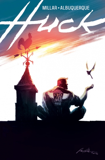
Huck Issue #1 - Like a great big hug


Huck Issue #1 is written by Mark Millar, art by Rafael Albuquerque, colours by Dave McCaig, letters by Nate Piekos and published by Image comics. Huck has one of the most beautiful covers that has come out this year so I was going to pick up a copy for the cover alone but when I finished reading it I was left with a big grin on my face and the feeling you get after you just cuddled the fluffiest kitten in the world while drinking a hot chocolate made by your grandma, in short it gave me the warm and fuzzies.

My favourite cover of the year

The comic begins with Huck travelling quickly along a road, hitching on the tops of cars, running a great distance and diving off a cliff into the ocean and digging through debris looking for something special. When Huck finds what he came for he returns it anonymously to the surprise of its bewildered owner, Diane. Diane learns from her elderly neighbour, Mrs. Taylor, that Huck was left at the orphanage as an infant with simply a note that said "please love him" and was raised to do a good deed every day by the nurses at the orphanage. Diane also learns that Huck has some special abilities that help make his deeds extra special such as being able to find anything that's lost, strength, speed, stamina and kind hearted nature. Mrs. Taylor lets Diane know that the people of the town know about Huck's special talents but keep them a secret from the outside world. While Huck thinks of his next good deed he sees a news report about some missing school girls and decides his other good deeds can wait.


The art of Huck is gorgeous the beautiful sunset cover alone being enough to convince me to pick up a copy without knowing a single thing about the story. The entire comic has this wonderful warm glow giving it a comforting feel. This comic makes me think of people and places from my childhood that are all tinted with the glimmer of nostalgia. The characters are drawn with a wonderful illustrated feel that reminds me of classic Disney such as The Aristocats and 101 Dalmatians.


I think the character of Huck is surprisingly developed for an issue #1 as we already know he is quiet and what some people may consider "slow" but that he has an overwhelming desire to do good ranging from leaving a nice note for a neighbour to rescuing missing fishermen. We haven't learnt much about any other characters except Mrs. Taylor who seems like a sweet old grandmother but I'm sure the young and skeptical Diane will have a part to play in the story.


I thoroughly enjoyed issue #1 of Huck and I'm not sure if I was won over by the concept of a comic about a person doing good deeds everyday or the beautiful art but its sometime nice to read something that does highlight the good in the world and appreciates the little things in life rather than constant struggles. I would recommend Huck to anyone who was interested in beginning comics and long term readers alike.
I give Huck issue #1 4 out of 5 good deeds.


Find out more about Huck here.

Saturday, 5 December 2015

Paper Girls Issue #1


Paper Girls Issue #1

Paper Girls is written by Brian K. Vaughan, art by Cliff Chiang, colours by Matt Wilson, letters by Jared K. Fletcher and published by Image Comics. You can't go on the comic corners of the web without seeing something about Paper Girls so it seemed like trying to swim against the current avoiding it. So I decided to pick up a copy for myself and found myself agreeing with most of the praise it is receiving.

Paper Girls begins with Erin preparing for her paper route the morning after Halloween or "Hell morning" as Erin dubs it due to the amount of teenagers still out causing trouble. During her route, Erin comes across some teenagers who begin to harass her but she is saved by other Paper Girls, Mac, KJ and Tiffany, who frighten the teenagers away. The girls decide it will be safer to team up to finish their deliveries and split into two groups, each group taking a walkie-talkie so they can stay in contact. Not long into their deliveries Erin and Mac receive a distress call from Tiffany and KJ and race over to help. After fighting off the mystery attackers the girls find something very, very strange.

I'd probably just avoid these guys if I saw them
The art of Paper Girls is just gorgeous and some how managed to make a group of 12 year old girls look like total badasses. Most of the panels are tinged with blue giving a creepy, abandoned feeling to the town that follows the girls even before their problems begin. The use of the girls clothing and costumes that the teenagers wear clearly shows this is taking place in the 80's without feeling the need to throw in unnecessary references to make the time period clear. I actually missed the date on the calendar at the beginning of the comic but had no problem placing the time period easily.

The character's each have their own personalities falling a little into the pop band stereotypes with the tough one Mac, the smart one Tiffany, the mature one KJ and the innocent dreamer Erin. That not withstanding it still captures the essence that they are still children. I particularly like the character of Mac who tries so hard to prove to everyone that she is tough but clearly is still just a child.

Badass
Paper Girls Issue #1 is a good comic and I enjoyed reading it but didn't think it was anything fantastic until the last page which ends on a brilliant cliffhanger that made my jaw literally drop while reading.

I give Paper Girls issue #1 4 out of 5 walkie-talkies.
Find out more about Paper Girls here.


Thursday, 19 November 2015

In The Local Pocket #4 - That Bulletproof Kid issue #1


That Bullet Proof Kid is written by Matt Kyme, art by Arthur Stickland, letters by Brendan Halyday and published by If? Commix. Bulletproof is one of the most well known local Australian comics with Matt Kyme being almost guaranteed to be at any local convention or event (go say hello, he's a cool guy). Bulletproof is a classic teenage superhero story done well but in a more Australian way making it far more relatable to local readers.

Bulletproof follows Anthony, a student beginning year eleven, as he is questioned by his friends on where he has been and why he missed so many social events over the holidays. Anthony recently becoming the sidekick known as Bulletproof to the hero Crusader, works on balancing his normal teenage life complete with normal teenage problems such as friends, girls and bullies with the added issues of being a masked superhero trying to save the world.
Way more interesting than my school holidays ever were
The way that characters are portrayed and act towards each other is fantastic and feels very genuine as though a group of  teenagers could be having the conversations on the page. A little scene that I really love is when the Anthony and his friends are lining up for their General Maths class they call it "vegie maths" which I find hilarious because I did a general maths class and we used to call it vegie maths too. The character of Anthony seems to be an average well rounded teenager dealing with issues that almost everybody will remember form high school such as friends, class, girls and bullies while also dealing with his new secret identity as Bulletproof. Anthony's character also seems to be having a minor struggle dealing with typical teenage vanity in the way of wanting his superhero identity to be in the limelight and tell his friends about his adventures while understanding that he can't show his talents for his own, and his friend's, safety. Anthony's friends seem like a very realistic group of teenagers who care about each other but still tease each other in a light-hearted way. The villain, Monochrome, although only in three panels has a pretty chilling presence, already making it clear that she will be a fantastic villain throughout the series.
The art of Bulletproof is on a whole different wave length than any other comics currently running with thick outlines and bold colours making it stand out on the shelf and grab your eye. All of the panels that involve superhero destruction and mayhem are rather interesting and bring to mind thoughts of classic superhero city destruction. The character designs are simple and the teenagers, unlike like many other comics, actually look and dress like teenagers. This may seem a strange thing to praise, having the characters actually look their age, but it is so common for young people in comics to be drawn as perfect specimens of human beings its rather refreshing to have teenagers actually look like teenagers with different body shapes.
We all knew somebody in high school with an awkward goatee

That Bullet Proof Kid is one of the most well known local comics and for a good reason it uses the classic formula of a teenage superhero trying to hide his secret identity and still have a mostly normal life and makes it relatable to a modern audience. The character's aren't full of excessive teenage angst nor are they played off like adults with everything under control and relatable characters are always a sign that a comic can be enjoyed by a wide audience.

I give That Bulletproof Kid 3.5 out of 5 explosions.

Find out more about That Bulletproof Kid here.

Monday, 19 October 2015

E Is For Extinction #1

E Is For Extinction #1

E Is For Extinction issue #1 is written by Chris Burnham, art by Ramon Villalobos, colours by Ian Herring, letters by VC's Clayton Cowles and published by Marvel. Extinction is part of the current Secret Wars universe. There are many, many, many different X-men series some are fantastic some are, well, just plain weird. Extinction kind of falls into the weird category and seems to require a lot of previous knowledge for an issue #1 completely losing the chance to pick up new fans that a lot of the other Secret Wars titles have done.
U is for Ugly
Extinction seems to begin during the events of New X-men where instead of forcing Cassandra out of his head Professor X instead shoots himself, killing both himself and Cassandra (It's X-men so death isn't exactly permanent) when she refuses to leave and if that sounds like a lot of information you don't understand for a first issue then you will begin to see the problem with this series. In the world of Extinction Magneto runs Professor Xavier's school for mutants after his death and mutants are far more accepted to the point that people want to have mutant children in hopes that they will have an ability that gives them an upper hand in life. Magneto's grand plan seems to be to use the students with psychic ability to attempt to revive whatever is left of Jean Grey/The Pheonix (because of course she is dead) but for what purpose exactly is not clear.
Also the U-Men turning up and start being jerks as usual
Extinction uses classic characters such as Cyclops, Beast, Emma Frost and Wolverine as well as characters from New X-men such as Beak, Angel, Quentin and the 5 Cuckoos. the well known characters keep their usually personalities and traits such as Magneto, in classic style, is manipulative towards the students for his own plans and Cyclops continuing to whine and complain about everything. Many of the characters from New X-Men have their character's standings changed from "special class" to suddenly badass personal guard of Magneto which although I enjoy seeing the use of the characters I have a hard time accepting that they are suddenly fit for battle against the U-Men considering one of them is a floating brain in a jar. One little Easter egg that I do think is fantastic is the inclusion of the character "Ugly John" a three faced mutant who dies in the New X-men, as a student at the institute. The reason I like the inclusion of Ugly John is mainly because his death in New X-men was not a pleasant one.

The art...... The art of Extinction.... I don't even know where to begin. I work with animals and I've seen hairballs more attractive than Extinction. Everything looks like its been dragged behind a couch that's in desperate need of a vacuum. This comic even makes Emma Frost, arguably one of the most beautiful women in comics, look like Jabba The Hutt's ugly sister. Wrinkles are exaggerated and all the characters (even the young ones) look ancient. In short I am not a fan.
What the hell?
The main problem I have with Extinction is the art, I will read an average story with good art, I will read a good story with average art but I find an average story with bad art almost impossible to read.

I give E for Extinction Issue #1 2 out of 5 mutant schools.

Monday, 5 October 2015

A Girl Walks Home Alone At Night #1

A Girl Walks Home Alone At Night #1 - Death Is The Answer

A Girl Walks Home Alone At Night is written by Ana Lilly Amirpour art by Michael DeWeese, lettering by Patrick Brosseau, edited by Ben & Jon Conrad and published by Radco. I picked up A Girl Walks digitally because of it's ultra creepy cover and strange name but mostly because it was only $0.99 and I'm shocking with impulse purchases. After reading A Girl Walks it seemed to fit the very definition of creepy and unsettling, so not a wasted $0.99. A Girl Walks Home Alone At Night is adapted from an independent film of the same name first released in 2014, receiving awards and being popular with both critics and audiences.
If I saw that at night I'd nope straight out of there
The story follows a vampire that stalks the people of the town as she contemplates the nature of peoples dark secrets and her own need to take lives. As The Girl takes a victim we learn she collects souvenirs from each kill, usually a ring, and that she has a lot of rings. The first issue leads us to believe that The Girl chooses her victims based on if they are either "good or bad" but her definitions of good and bad are not yet made clear.
Also she likes cats, so that's nice

The comic is based entirely around the character of The Girl, who gives off an overwhelming sense of loneliness throughout the issue. The impression that the girl chooses her victims based on perceiving them as good or bad makes you think that perhaps she is not a complete monster and does not take joy in her killings, shown when she turns away from a young boy saying she will wait to see what kind of person he becomes, but her collection of souvenirs from her victims perhaps suggests otherwise.

The art is done entirely in black and white and has some incredibly haunting imagery. The look of The Girl's look with her long hooded cape invokes imagery of the grim reaper without going over the top into the stereotypical Dracula look. The violence and gore is disturbing and confronting without becoming grotesque which is always the mark of a good horror comic.

A Girl Walks Home Alone At Night is a great comic that turns the creep factor all the way up and any fan of suspenseful horror movies will probably really enjoy it. If you're a bit of a scaredy cat and have trouble with horror stories this could be a good starting place as their is far more emphasis on atmosphere rather than gore or violence.

I give A Girl Walks Alone At Night 4 out of 5 skate boarding vampires.

Find out more about A Girl Walks Home Alone At Night here.