Beware Spoilers Ahead!

My reviews do contain spoilers about the main stories but I do attempt to keep them at a minimum. I will not reveal any major plot points or twists unless stated at the beginning of a review.

Showing posts with label The Local Pocket. Show all posts

Saturday, 20 May 2017

In The Local Pocket #10 - Job Dun, Fat Assassin #1


Job Dun, Fat Assassin #1

Job Dun, Fat Assassin is an Australian comic written by Mark Hobby, illustrated by Ben Michael Byrne, colours by Noelle Criminova, letters by Bolt-01. Job Dun is gross, one of the grossest things I've ever read so if you have a weak stomach turn back now and go check out my review of Huck, if not then read on.


Look I'm going to be honest with you I don't entirely understand what is going on in Job Dun. So far as I can tell Job Dun is an assassin/bounty hunter with an implant in his brain called a Spray Maker that lets the user "spray paint reality". This seems to mean that the user will see an glossed over version of the world with everyone being more attractive than they really are, when its online that is. Dun is hired by Lady Octavia to do a retrieval mission and bring back a man named Conos. Conos is now the leader of a strange cult that Job must now infiltrate to retrieve him.

Spray off Vs Spray on
The art of Job Dun is, look, I didn't want to review this comic, its gross. The main reason I didn't want to review this comic is because I didn't want to have to read it multiple times and look at how gross it is.  I've mentioned before that I'm not a huge fan of toilet humour but when done well like in The Pro, a comic I recently reviewed, it can work and work well, Job Dun however looks like the inside of a sewage system by comparison. There are boobs on almost every page, to the point that they randomly show up at any point in the comic. I'm normally all for surprise boobs but they need to serve a purpose. Any panel where Dun is not affected by the "Spray Maker" makes the world look grotesque, think dropping a lollipop behind a couch levels of gross. This is actual not a criticism of the artist Ben Michael's art, he does a wonderful job portraying this grossness. Michael's also does a series called Kranburn which is a fantastic post apocalypse series set in Australia which is just so, so good and I'd suggest going to read that instead.

Annnnnnnnd I'm out
Although I did finish the comic I didn't think much about the characters as I mentally checked out after Dun got splashed in the face with a strippers breast milk. I don't get this kind of humour in the same way shows like Ren and Stimpy never appealed to me, even as an adult but I can see how some people with a slightly twisted sense of humour may like comics like Job Dun.

Oh look sexy nuns, how...... Funny......
As for a rating for Job Dun: Fat Assassin I will leave it with, what I feel is a very fitting, quote from the movie Billy Madison: What you've just said is one of the most insanely idiotic things I have ever heard. At no point in your rambling, incoherent response were you even close to anything considered a rational thought. Everyone in this room is now dumber for having listened to it. I award you no points, and may God have mercy on your soul.


Find out more about Job Dun: Fat Assassin here.

Sunday, 8 January 2017

In The Local Pocket #9 - Any Port In Storm


Any Port In Storm #1

Any Port In Storm is written and illustrated by Ben Quinlan and published by Inkling Comics. Making comics is extremely hard work, especially when a creator takes on the task of writing and illustrating the entire thing themselves. Sadly hard work doesn't always translate to an enjoyable read and, although showing effort, Any Port In Storm is an example of this.


Storm City is a dying city, The local businesses are failing and it's people are moving away, Storm City will soon become a ghost town. Tag is desperate to save her family's store and attempts to run tours of the city to try and bring in some business. The trouble began for Storm City when teleporting became illegal, due to the chance that it can horribly disfigure those unfortunate enough to have their molecules pass through those of another teleporter, making it difficult to get supplies and people in or out of the city.

Like a near constant disco
The art of Any Port In Storm has some admirable concepts that if carried out well would make for some interesting visuals, unfortunately I feel that Quinlan has overstretched as an artist, leaving the art falling flat. The art suffers from three main issues, first being texture. There is either too much of it or none leaving some panels looking strangely stained or completely flat. Secondly the camera angles, while using different camera angles can sometimes add to a panel having too many panels with strange camera angles can just make the whole thing look confusing. Lastly the teleporting, comics are a visual medium so when a power or ability such as teleporting is used there needs to be some kind of energy effect to show that something has happened, such as a burst of light or a warped background before the character appears. Any Port In Storm doesn't have any visual indication that characters have teleported, they are just not in one panel and then in the next. For all the reader knows they walked from around the corner, which makes the transitions in what is happening from panel to panel a little unclear. When teleporting is such an important part of a story it really needs to be emphasised more in the art.


One thing I really like about Any Port In Storm is the main character Tag, she is running walking tours of the city to try and bring any sort of income into her family's shop in an attempt to keep them from bankruptcy which would force them to leave Storm City. Why is Tag so desperate to keep her family from leaving Storm City? Simple, because it is her home and she loves it. So often a ridiculous reason that a character wants to avoid moving is shoehorned in like "grandma told me I needed to look after the house before she died" or "I can't move my asthmatic, dying cat because if I unplug their life-support system the shock could kill him". Any Port In Storm gives a very real and relatable motivation for Tag to wanting to stay in Storm City.


Any Port In Storm has the potential to be an interesting comic of corporate espionage and conspiracies but falls down in  a few areas with the art and transitions being it's biggest issues. The frame work is there unfortunately it just doesn't quite hit its mark.


I give Any Port In Storm 2 out of 5 Tag's Tours.

Find out more about Any Port In Storm here.

Monday, 2 January 2017

In The Local Pocket #5 - Black Fish

In The Local Pocket #4 - Black Fish

Black Fish is written and illustrated by Tatiana Davidson and self published. I picked up Black Fish at Supanova where I often purchase many comics by local creators as it is a great way to find comics that are artistic, mini comics, poetry comics and all sorts of comics that are a little less traditional. This was no less the case for Black Fish, with its creepy cover seeming to stare into my soul making it almost impossible to not pick up a copy (and of course get the author to sign it for me).


Black fish begins with a young girl using the pond in her back yard as a quiet escape from chaos and noise of her large family. As the girl enjoys the silence of her own little world by the fish pond she notices something new in the pond, a small, black, slimy, hungry fish. The next time the girl visits the pond she notices that the small black fish has grown immensely but she can't seem to find any of the koi fish. Some time later the girl looks over her dark yard and sees something large, black and slimy creeping towards the house.

Hey little guy, I'm sure you'll stay little and cute and not get large and terrifying
Every panel in Black Fish is, at the very least, unnerving with some being downright terrifying. Its amazing how even something as simple as a fern frond is made to look sinister with simply the use of  light and dark. The design of the Black Fish in all of its stages looks like it is stitched together from creatures that actually exists adding yet another layer of sinister dread to the book.

Black fish is is a refreshingly different kind of horror comic containing absolutely no gore, relying not only on atmosphere but the readers own imagination to make it scarier than most modern horror movies. Black Fish is magnificently illustrated, , superbly written and mercifully brief, proving that sometimes less is more. I briefly met the creator, Tatiana, at Supanova this year and chatted with her for a minute, got her to sign my copy of Black Fish and walked away satisfied as Tatiana seemed like a nice normal person. After reading Black Fish I think if I meet her again I will back away slowly while maintaining eye contact until I feel I am an appropriate distance that I can turn and run because I refuse to believe that someone as nice as Tatiana seemed can come up with something as unnerving as Black Fish.
NOPE

I give Black Fish 4.5 out of 5 little black fish


Find out more about Black Fish here. Black Fish will be included in an upcoming horror anthology so keep an eye on their Facebook page Mr. Splitfoot for more information.

Sunday, 6 November 2016

In The Local Pocket #8 - Collateral - Dear John Issue #1


Collateral - Dear John #1 Vacant City

Collateral - Dear John is written by Matt Nicholls and illustrated by Lee Taylor and self published. Everybody loves superheroes and everybody wants to live in a world with superheroes flying through the skies and defeating the bad guys. It sounds great to live in a world with superpowers if you are one of the superheroes saving the day and involved in the action, It sounds a lot less fun if you were just a regular person who's life is constantly being interrupted and endangered by these Superheroes.


Collateral begins with an incredibly violent depiction of a child being gruesomely crushed as they watch a superhero fight a villain above the city. It turns out that this is a PSA commercial warning civilians that if there is a super powered battle around they should flee for their own safety. A young man named Scott shuts off the TV in disgust while his mother, Mary, warns him that paying attention to those PSAs could save his life one day. Mary's husband, John, soon arrives home and walks straight to the bedroom without uttering a single word. Mary goes to check and John admits that once again he is unemployed. John has not lost his job because he is a poor worker, had a disagreement with his boss or because the company is downsizing, John has lost his job because a Super Villain destroyed the building he worked in. This is not the first time John has been unemployed due to the damage and mayhem caused by those with super powers.

Aww is this going to be a superhero co-OH MY GOD!!

Collateral is done entirely in fine black lines and has a sketchy look which is an interesting style although it does make it a little difficult to tell certain characters apart at a glance. Collateral has no colour other than the extremely bright red of the blood in the opening pages but the most eye catching feature is by far the paper. Collateral is not on plain white background but rather the background has a yellow weathered appearance that makes me think of an old dilapidated building. The background is by far the most striking feature of this comic and coupled with the sketchy art gives Collateral an incredibly unique style and makes it a visual delight.


We don't learn much about John, Mary and their three children Scott, James and Timmy but we do learn a lot about their relationships with each other which is what grabs the reader in the first issue. Mary seems like the average wife and mother trying to make the best out of a bad situation doing her best to reassure her husband and sons that everything will be okay despite their hardships. Something that I love about the character of Mary is that she is oddly concerned about her family swearing and constantly tells them off for it. At first I thought this was an odd choice but as I reread the comic it is a great example of how Mary is trying to keep life normal for her family as they have so many worse problems than foul language yet its still a way for her to keep things together. John is a man clearly pushed to the brink and desperate to make ends meet for his family in the face of constant and uncontrollable set backs.

The concept of people dealing with the aftermath of superhero collateral damage is an idea that has been done before but usually from a comedic angle. Collateral - Dear John takes an emotional angle from the first issue and if the tone of the first issue is anything to go by it promises to be an emotional ride.

I give Collateral - Dear John 3 out of 5 crisis moments


Find out more about Collateral - Dear John here and read it online here.

Sunday, 14 August 2016

The Local Pocket #6 - Nevermorrow

I was lucky enough to get a sneak preview at the unfinished, let alone published, Never Morrow. Never Morrow is written and illustrated by Chris McQuinlan and self published through Kickstarter. There are still a few days left on the Kickstarter so if you hurry there is still time to pledge for your own copy for as little as $3.

Never Morrow begins with the crew of a spaceship waking up after time in cryosleep as their ship approaches a previously undiscovered planet. As the crew take their positions, the ship's landing gear fails causing it to crash land on this new uncharted planet. As the dust settles the only survivor is Professor Mannix and the ships A.I. Ozma. With few options Professor Mannix leaves the ship with Ozma and searches the plant for intelligent life that may be able to help. It doesn't take long for Professor Mannix to realise that something is very wrong on this peculiar planet.

The copy that I was given the chance to read did not have the completed art so I will be making my assessment of the art by the promotional material and panels already released. The design of the ship is very different from the standard sleek and streamline spaceship and has a boxier look, that I can only describe as a flying USB, and is a much more interesting design than the standard sleek "sports model" style space ships that is so common. The design of the Ozma drone is essentially just a floating camera with fins but is still adorable and somehow manages to give the little A.I. computer heaps of personality.

Never Morrow is focused entirely on professor Mannix who is full of a mixture of wonder and apprehension about the uncharted planet. As I was reading I originally found it very strange that Professor Mannix decided to leave the ship immediately after the crash landing, paying no attention to the bodies of the unfortunate crew. But as Mannix traverses the terrain the professor is struck with a sudden realisation that everyone else is dead and the only one left is the A.I. Ozma. After reading the moment where Mannix has the sudden realisation of the true gravity of the situation made me think that leaving the ship immediately and ignoring dead is similar to how a person in shock would react and gave Professor Mannix a huge amount of depth very quickly.
Professor Mannix

Being familiar with Chris' other work Never Morrow is very different from what I expected which is no way a criticism. I really enjoyed Never Morrow and I can't wait to see it all put together, polished and finished.

It is very difficult to give a rating to an unfinished comic so from what I've seen so far I give Never Morrow 4 out of 5 Ozma drones

Find out more about Never Morrow here and pledge on Kickstarter here.
See more of Chris McQuinlan's work here.

Sunday, 17 July 2016

In The Local Pocket #7 - 5 Seconds


5 Seconds


5 Seconds is written by Sydney local Stephen Kok, illustrated by P.R. Dedelis, colours by Peyton Freeman and self published through Kickstarter. As a child I always wanted time travel powers, more than any other super power, but I wasn't greedy about it. I only wanted to be able to rewind or see into the future by about 10 seconds so I could change my answer to a question or change the outcome of an awkward situations. So when I read the concept for 5 seconds I was pretty interested, being able to see five seconds into the future could be an incredibly useful super power.


5 Seconds begins with our two main characters, Ellie and Jake, on the phone as Jake reveals his newly discovered talent, he can see five seconds into the future. Jake, rather adorkably, asks Ellie on a date so he can demonstrate his new found powers to her. During their coffee date Ellie tests Jake's new talent with a deck of cards discovering that he can see exactly five seconds into the future. Jake decides that the local casino may be the perfect place to test exactly how well his powers work despite Ellie's concerns of running into a "Joe Pesci" type character and possible repercussions from the casino. Unfortunately for Ellie and Jake they should have been more concerned about the criminal in a tough spot who overheard their conversation and thinks that perhaps he may also be able to cash in on Jake's new ability and follows them to the casino to see the proof for himself.


The three main characters are Ellie, Jake and Lucas the criminal. Ellie and Jake interact really well together as they explore Jake's newly discovered precognitive powers. Often character's in comics (and most stories in general) immediately accept unbelievable claims that are placed before them and its refreshing to see a character actually test their friend's power as Ellie does in 5 Seconds. After Jake proves his power Ellie plays the part of a great supportive friend. Lucas is in no way a good guy but he does actually have some motivation as to why he decides to go after Ellie and Jake as he is in a desperate situation and in trouble with even worse people. It's refreshing to see a bad guy written with more motivation than "is a bad guy" and makes the reader feel at least a little sorry for them or gives some explanation as to why they are doing the things they do.


5 Seconds incorporates a very interesting art style to show past, present and future explained in a foreword by Ellie and Jake. Sepia is used for past, regular colours for present and a whitewash kind of style for the future, this is a creative and practical way to easily tell the time periods apart including clearly showing a vision of the future that happens in the past that sounds like it would be complicated but with this system is easily understandable. The art of 5 Seconds is bright, colourful and seems to have a bit of an anime influence with clear facial expressions that are emotive and easy to read.


A lot of comics waste time with an origin story of the protagonist's powers but 5 Seconds has none of that and decides to just skip any reason for the powers and just cut straight to the story. Skipping a power origin actually works in this case but 5 Seconds is still an origin story as Jake learns to control and use his powers and I'm already excited for the sequel that has been confirmed and you can keep track of here.

I give 5 Seconds 3.5 Decks of cards


Find out more about 5 Seconds here.

Thursday, 19 November 2015

In The Local Pocket #4 - That Bulletproof Kid issue #1


That Bullet Proof Kid is written by Matt Kyme, art by Arthur Stickland, letters by Brendan Halyday and published by If? Commix. Bulletproof is one of the most well known local Australian comics with Matt Kyme being almost guaranteed to be at any local convention or event (go say hello, he's a cool guy). Bulletproof is a classic teenage superhero story done well but in a more Australian way making it far more relatable to local readers.

Bulletproof follows Anthony, a student beginning year eleven, as he is questioned by his friends on where he has been and why he missed so many social events over the holidays. Anthony recently becoming the sidekick known as Bulletproof to the hero Crusader, works on balancing his normal teenage life complete with normal teenage problems such as friends, girls and bullies with the added issues of being a masked superhero trying to save the world.
Way more interesting than my school holidays ever were
The way that characters are portrayed and act towards each other is fantastic and feels very genuine as though a group of  teenagers could be having the conversations on the page. A little scene that I really love is when the Anthony and his friends are lining up for their General Maths class they call it "vegie maths" which I find hilarious because I did a general maths class and we used to call it vegie maths too. The character of Anthony seems to be an average well rounded teenager dealing with issues that almost everybody will remember form high school such as friends, class, girls and bullies while also dealing with his new secret identity as Bulletproof. Anthony's character also seems to be having a minor struggle dealing with typical teenage vanity in the way of wanting his superhero identity to be in the limelight and tell his friends about his adventures while understanding that he can't show his talents for his own, and his friend's, safety. Anthony's friends seem like a very realistic group of teenagers who care about each other but still tease each other in a light-hearted way. The villain, Monochrome, although only in three panels has a pretty chilling presence, already making it clear that she will be a fantastic villain throughout the series.
The art of Bulletproof is on a whole different wave length than any other comics currently running with thick outlines and bold colours making it stand out on the shelf and grab your eye. All of the panels that involve superhero destruction and mayhem are rather interesting and bring to mind thoughts of classic superhero city destruction. The character designs are simple and the teenagers, unlike like many other comics, actually look and dress like teenagers. This may seem a strange thing to praise, having the characters actually look their age, but it is so common for young people in comics to be drawn as perfect specimens of human beings its rather refreshing to have teenagers actually look like teenagers with different body shapes.
We all knew somebody in high school with an awkward goatee

That Bullet Proof Kid is one of the most well known local comics and for a good reason it uses the classic formula of a teenage superhero trying to hide his secret identity and still have a mostly normal life and makes it relatable to a modern audience. The character's aren't full of excessive teenage angst nor are they played off like adults with everything under control and relatable characters are always a sign that a comic can be enjoyed by a wide audience.

I give That Bulletproof Kid 3.5 out of 5 explosions.

Find out more about That Bulletproof Kid here.

Monday, 31 August 2015

In The Local Pocket #3 - Carmen #2

Carmen #2

Carmen #2 is written by Mike Speakman, art by Matty Taylor, letters by Tom Orzechowski and published by Dumb Skull Ink. Finally the wait is over for the much anticipated second issue of the local comic Carmen, a spy thriller. I was so excited as I eagerly swiped my way through my digital copy (I was far too inpatient to wait for my physical copy) the only downside is now I have to wait for issue #3.

Issue #2 begins where issue #1 left off with Carmen the captive of the corrupt Booker King, CEO of King-Dome Come Industries, and being interrogated about her deceased boyfriend Brody. Booker King begins to reveal why Brody needed to be eliminated but still not what their plans are for Carmen. We also learn more about Lucas, the solider, who returns to his family farm with a dark secret and darker memories.
Not the face of a man having pleasant dreams

As I've mentioned before I'm a huge sucker for anything done with water colour and Carmen #2 is no exception. Despite their quirky, yet refreshingly different, design the character's still have expressive face. The backgrounds are mostly single colours but have a fantastic way of setting such a foreboding tone for the entire comic.
This is my favourite panel, poor Vincent.

In issue #2 we get more of an insight into the ruthlessness of Booker King, his shady dealings and hints at just how much influence and power he has (hint: It's a lot). More is revealed about Lucas, the reportedly dead solider returning home, and what exactly happened to him and Brody in the army.

Carmen #1 was a great comic but issue #2 has really hit its stride telling an incredibly story with both frightening and sympathetic characters and using unconventional art style to set a tone full of dread. Carmen so far is telling a story that is not so far-fetched that it couldn't happen (science fiction elements aside) giving it a truly frightening element to it, they aren't fighting the Cobra Commanders trying to conquer the world for undisclosed reasons or Hydra endlessly trying to destroy a small group of super beings, This is a corrupt organisation who's super power is money and influence and you don't get much more realistic than that.

I give Carmen 4 out of 5 thumping hearts

Find out more about Carmen here

Carmen is a local comic supported by Kickstarter which if you haven't used before not only helps support indie comics and other project but gives the people who support projects opportunities for extra bonuses such as signed art work and the chance to be in the comic, so keep an eye out for the next kickstarter opportunity.

Monday, 27 April 2015

In The Local Pocket #2 - Fly The Colour Fantastica

Fly The Colour Fantastica

This year at Supa Nova as I wandered through the artist alley, looking at local comics, art and sketches, a book caught my eye. This book was so beautiful I went straight over to the stall and had already decided I wanted to buy whatever they were selling. Fortunately for me the lovely ladies at the stall were selling a comic anthology called Fly The Colour Fantastica which ended up being one of my favourite purchase at Supa Nova this year.
Just gorgeous
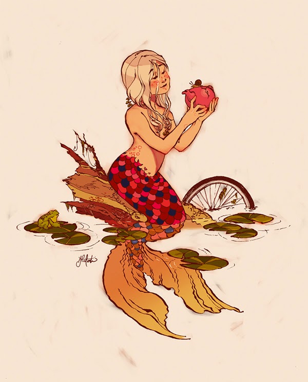
A comic anthology is a collection of short comics usually with a similar theme running through each comic, in the case of Colour Fantastica all the comics were written and illustrated by 12 Australian, female artists. Some of the stories are happy, some sad, some mysterious but all of them touching and beautiful. I could tell you about all the comics in the book but it is more fun if you buy it and discover them for yourself so I will tell you that my favourite is Chapter 1: Serendipity, which is about a boy who meets a mermaid.

Serendipity by Natasha Sim
I'm always cautious about writing my interpretation of wordless comics because I want you to read them and interpret them yourself but I will say that with most of the comics having little to no dialogue you really feel the stories. Some of the stories may take you back to your childhood, some will bring you to the present day and others will take you to how you hope the future will be but all of them will make you think and all of them will make you feel.
Every single comic in Colour Fantastica has amazing art, I was not disappointed in any of the art styles and they complimented each other beautifully. You can see many of the styles have a Japanese influence and as the name suggests all the comics have a fabulous use of colour.

I could write for pages and pages all the great things about Colour Fantastica but the main thing is that I love it and I want everyone else to love it too. I would recommend Colour Fantastica to first time comic readers, long term comic readers, art fans and anybody that loves colour.

I give Fly The Colour Fantastica 4.5 out of 5 big yellow monsters.


Get your copy of Fly The Colour Fantastica here.

You can find out more about the artists here.

11 of the 12 creators
It is always a thrill to go to conventions and actually meet the creators of local comics and at this year's Supa Nova I had the absolute pleasure of meeting Alisha Jade the writer of Freedom.
Alisha isn't in the picture above with the other creators so she gets her own picture.